Typography - Exercises
30/08/17 - 27/09/17 (Week 1 - Week 5)
Seoh Yi Zhen (0328497)
Typography
Exercises
Typography
Exercises
LECTURE NOTES
Lecture 1: Briefing30/08/17 (Week 1)
We did not have a lecture for the first week of class. Instead, Mr Vinod briefed us about this module- what to expect and the breakdown of our future assignments. After creating our Blogger sites, he explained to us in detail what needed to be in our blogs as well as the format that we were supposed to follow. He made himself very clear on everything he wanted in our blogs.
He then gave instructions for our first calligraphy exercise. He also showed us examples from the previous intake so that we had a better idea of what to do. Before dismissal, everyone had to research on round hand, blackletter and uncial and choose one hand to practice for our calligraphy exercise.
Lecture 2: Introduction to Typography
06/09/17 (Week 2)
In essence, typography is the style and appearance of printed matters. The history of typography is an evolution- originating from calligraphy, evolving to lettering, then finally to typography.
Typography is an art form, and as with any art form it comes not with hard-and-fast rules, but instead with conventions that can be broken as one sees fit. Unfortunately, due to the invention of applications, many people can now try their hand in this once specialized field. This has caused the democratization of typography and has led to a decline in typographic quality.
Important terminology in typography:
- Font: The process of creating a typeface.
- Typeface: The weight of a family.
- Type family: Typeface designs that vary from a basic style of alphabet.
Lecture 3: Cancelled
13/09/17 (Week 3)
There was no lecture during the third week as Mr Vinod had urgent matters to attend to. We were also pressed for time due to the submission of our calligraphy exercises.
Lecture 4: Typography Anatomy
20/09/17 (Week 4)
This week, we were introduced to the technical terms used to describe specific parts of the letterforms. Knowing the components that make up a letterform is important because it makes identifying specific typefaces much easier. He also mentioned some interesting facts about these components. For example, the apex and vertex of letterforms are blunted so that the letterforms look complete, instead of continuing on for infinity.
According to Mr Vinod, a full font is a complete family that contains all the different typefaces. Expert sets are sets that contain small capitals and are usually found in serif families. Some semi-serif families also have expert sets. We also learnt about the different terms used to describe typefaces, like roman, italic, light, etc.
Lecture 5: History of Typography
27/09/17 (Week 5)
Early letterform development began with the Phoenicians- uppercase letterforms that consisted of straight lines and pieces of circles. The Greeks then developed a style of writing called 'boustrophedon'- lines of text read alternately from left to right then right to left.
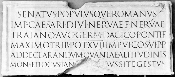
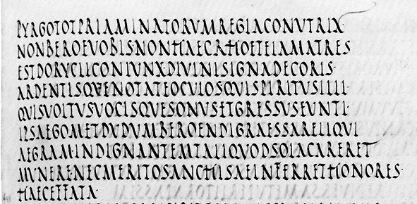
Square capitals were the written versions of letterforms found on Roman monuments. However, they soon evolved into rustic capitals- a compressed version of square capitals that allowed for twice as many words on a parchment paper and took much less time to write.
During Charlemagne's reign, text was rewritten and standardized all throughout Europe, which then set the standard for calligraphy for a century. However after the dissolution of his reign, a condensed, strongly vertical letterform known as Blackletter quickly gained popularity.
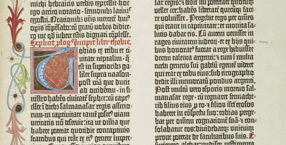
Gutenberg then introduced printing that mimicked the work of the scribes' hands. His type mold required different brass matrices, or negative impressions, of each letterform.
Lecture 5: History of Typography
27/09/17 (Week 5)
Early letterform development began with the Phoenicians- uppercase letterforms that consisted of straight lines and pieces of circles. The Greeks then developed a style of writing called 'boustrophedon'- lines of text read alternately from left to right then right to left.
 |
| Fig. 1.1: Boustrophedon. |
Square capitals were the written versions of letterforms found on Roman monuments. However, they soon evolved into rustic capitals- a compressed version of square capitals that allowed for twice as many words on a parchment paper and took much less time to write.
 |
| Fig. 1.2: Square capitals. http://www.lancaster.ac.uk/users/yorkdoom/palweb/week02/romcaps.jpg |
 |
| Fig. 1.3: Rustic capitals. http://www.lancaster.ac.uk/users/yorkdoom/palweb/week03/romrus/romrus.jpg |
During Charlemagne's reign, text was rewritten and standardized all throughout Europe, which then set the standard for calligraphy for a century. However after the dissolution of his reign, a condensed, strongly vertical letterform known as Blackletter quickly gained popularity.
Gutenberg then introduced printing that mimicked the work of the scribes' hands. His type mold required different brass matrices, or negative impressions, of each letterform.
 |
| Fig. 1.4: The Gutenberg bible. https://exhibitions.lib.cam.ac.uk/filestore/8/1/4_a92960476f2a860/814_alt_1836_07a6476dc22c2f6.jpg |
INSTRUCTIONS
EXERCISE
Calligraphy (Week 1 - Week 3)
Before starting on our chosen hands, we were required to complete the basic practice of horizontal, vertical and circular strokes. The aim of this practice is to help us get used to the calligraphy pen, and to ensure that we maintain the thickness of our strokes throughout.
 |
| Fig. 2.1: Horizontal lines. |
 |
| Fig 2.2: Vertical lines. |
 |
| Fig 2.3: First try of circles. |
 |
| Fig 2.4: Second try of circles (after self-critique). |
After completing this practice, we began to work on our lettering. I chose Uncial because I liked the roundness of the letters. It was hard to get used to this hand at the start, but after understanding the way the letters are formed, this practice became a lot easier.
 |
| Figure 3.1: First reference used. |
 |
| Fig 3.2: Second reference used. |
 |
| Fig 3.3: Practice of Uncial. |
 |
| Fig. 3.4: Alphabetical drills (A-P). |
 |
| Fig. 3.5: Alphabetical drills (Q-Z). |
 |
| Fig. 3.6: Initial practice of selected poem. The leading was too loose and the kerning was uneven as well. |
 |
| Fig. 3.7: The leading was much better than before. Unfortunately, I made a spelling mistake in the second attempt. |
 |
| Fig. 3.8: Finalized practice of the haiku. |
 |
| Fig. 3.9: Final piece. |
Lettering (Week 3)
The next exercise was to create a lettering for our names that reflected our personality. At first, I tried to design a more geometric lettering to show that I am a logical and rational person. Then I got stuck and switched to a minimalistic style that reflected my simple nature better.
 |
| Figure 4.1: Concept sketches for this lettering exercise. |
 |
Figure 4.2: The selected design traced on Adobe Illustrator. |
Because I chose a minimalist style, I decided on a simple fade-in animation for my text. I did a rough animation using only 10 frames to help me better visualize the final result and plan out which lines should appear first.
 |
| Figure 4.3: Initial attempt using 10 frames. |
After finalizing my plan for the fade-in, I created 43 artboards in Illustrator to make sure the transition was smooth, then I exported it over to Photoshop to finish up the animation.
 |
| Fig. 4.4: Screenshot of my Illustrator artboards. |
 |
| Fig 4.5: Thumbnails of process. |
 |
| Fig. 4.6: Final result. |
Type Expression (Week 4)
For this exercise, using only a specified group of typefaces, we had to express the meaning of these six words- jumbo, noisy, crooked, hollow, deep and dig. We were not allowed to distort any of the letters, but only rotate, flip or scale them proportionally.
 |
| Fig. 5.1: Initial attempt of this exercise. |
When Mr Vinod critiqued my work, he said that my "crooked" wasn't crooked enough, and that I should just apply the gradient to all the letters of "deep". Although he said that my "dig" was fine, I chose to redo it anyway because most of my classmates designed it like this as well.
 |
| Fig. 5.2: Type expression (after feedback). |
I decided on the word "noisy" for the animated type expression.
 |
| Fig 5.3: Chosen type expression: NOISY. |
 |
| Fig. 5.4: Thumbnails of NOISY. |
 |
| Fig. 5.5: Exporting the artboards to Photoshop. |
 |
| Fig 5.6: Final result. |
FEEDBACK
Week 1:
Was given the go-ahead with my chosen hand, Uncial.
Week 2:
Horizontal, vertical and circular strokes are very neat. When I showed him my letters from A to D, he said that I was doing a good job so far and to carry on with the work.
Week 3:
Mr Vinod was very impressed with my final piece for the calligraphy exercise. The only comment he had was regarding the paper that I used because the ink bled a little at certain places. As for the lettering exercise, he liked my minimalistic design but the animation still required more work to make the fade-in smoother.
Week 4:
Mr Vinod liked my animation for the lettering exercise. As for the type expression exercise, he liked my "jumbo", "noisy", and "hollow", but the designs for "crooked" and "deep" needed more work. When I showed him my type expression animation, he did not like my original idea of the letters popping up to create noise. Instead, he said that the noise should already be there from the start and that the animation should only enhance it.
REFLECTION
Experience:
In week 1, I struggled a lot with the vertical and circular strokes. I chose to redo the circles many times because I was extremely unsatisfied with them. Week 2; I got pretty good at doing the circles, not surprising considering I used up a whole pen just doing them. It reached a point where this practice actually became therapeutic. Week 3; I enjoyed the lettering exercise a lot because we finally had the freedom to express ourselves after the extremely restrictive calligraphy practice. Week 4; this week's class was quite tiring because of all the intensive work we had to complete within that short period of time.
Observation:
Week 1; I realized that my horizontal and vertical strokes usually go in a diagonal direction. Week 2; I found writing in the Uncial hand much easier than doing the previous strokes practice. But when I tried to write the quote on A4 paper, the ink bled so much that the text was barely legible. Week 3; Coming up with the lettering design was easy. However, I struggled a lot with the animation as I did not have a clear vision of how to execute my idea. Week 4; I noticed that many of us designed the type expressions in similar ways.
Findings:
Week 1; when I place my paper on the table, I unconsciously place it at an angle, following my usual writing style. This habit had to be fixed in order for my lines to be straight. Week 2; the circular strokes practice really helped me with the Uncial hand because most of the letters are very rounded. Also, A4 paper is not good for calligraphy because it is too absorbent. A thicker or waxier paper must be used in order for the calligraphy to look nice and smooth. Week 3; I realized that when I was doing the work in class I was too frazzled to concentrate properly. Sitting down in a quiet setting really cleared my mind and gave me a solid direction on how I wanted to animate my design. Week 4; no matter how original I think my work is, I should always look at what others are doing so that I can avoid following the crowd.
30/08/17 - 13/09/17 (Week 1-3)
This book breaks down basic typographic principles and presents them in a way that relates to everyday situations for effective reader comprehension.
The first thing I learnt is that good typography is "invisible". It has to look so normal that readers don't even notice they're reading it. The art of typography presents information in such a way that the reader doesn't get sidetracked into thinking about the fact that every single line, paragraph and column had been meticulously arranged within the boundaries of a page. And even though most people would not be able to know the difference anyway, typographers spend a huge amount of time and effort choosing typefaces and perfecting details that are invisible to the untrained eye.
"We read best what we read most, even if it is badly set, badly designed, and badly printed." (Speikermann, 1993) This does not excuse bad typography, but type designers should be aware that there are certain images imprinted in a reader's mind. For example, newspaper articles; readers still put up with bad line breaks and huge word spaces because that is what they're used to. Therefore, sometimes it may be best to follow the rules; other times, the rules need to be broken in order to effectively send a message across.
EXPLORING TYPOGRAPHY by Tova Rabinowitz Deer
14/09/17 - 27/09/17 (Week 3-5)
According to the author, legibility refers to "the ease with which a reader can recognize and differentiate between letterforms". Terrible handwriting for example, is a form of illegibility. When letterforms vary too much from their simplest forms, readers may feel confused or frustrated; hence, reducing comprehension. Readability, on the other hand, refers to "how easily a page of text can be read and navigated". Even if the text is legible, readers may find it difficult to read if a layout is messy or crowded.
Factors that influence legibility:
FURTHER READING
Stop Stealing Sheep & find out how type works by Erick Speikermann30/08/17 - 13/09/17 (Week 1-3)
 |
| Fig. 6.1: Stop Stealing Sheep & find out how type works |
This book breaks down basic typographic principles and presents them in a way that relates to everyday situations for effective reader comprehension.
The first thing I learnt is that good typography is "invisible". It has to look so normal that readers don't even notice they're reading it. The art of typography presents information in such a way that the reader doesn't get sidetracked into thinking about the fact that every single line, paragraph and column had been meticulously arranged within the boundaries of a page. And even though most people would not be able to know the difference anyway, typographers spend a huge amount of time and effort choosing typefaces and perfecting details that are invisible to the untrained eye.
"We read best what we read most, even if it is badly set, badly designed, and badly printed." (Speikermann, 1993) This does not excuse bad typography, but type designers should be aware that there are certain images imprinted in a reader's mind. For example, newspaper articles; readers still put up with bad line breaks and huge word spaces because that is what they're used to. Therefore, sometimes it may be best to follow the rules; other times, the rules need to be broken in order to effectively send a message across.
EXPLORING TYPOGRAPHY by Tova Rabinowitz Deer
14/09/17 - 27/09/17 (Week 3-5)
 |
| Fig. 6.2: EXPLORING TYPOGRAPHY |
According to the author, legibility refers to "the ease with which a reader can recognize and differentiate between letterforms". Terrible handwriting for example, is a form of illegibility. When letterforms vary too much from their simplest forms, readers may feel confused or frustrated; hence, reducing comprehension. Readability, on the other hand, refers to "how easily a page of text can be read and navigated". Even if the text is legible, readers may find it difficult to read if a layout is messy or crowded.
Factors that influence legibility:
- Style of a typeface (familiarity, type styles, colour and value, typographic colour, texture of type)
- Size and shape of type (stroke weight, contrast, set width, point size)
- Background (contrast between text and background, texture, surface)
- Typeface selection (consistency of form, proportion and spacing, legibility at a variety of point sizes, completeness of character sets, availability of designed type styles)
- Arrangement of letterforms (alignment, measure, widows and orphans)
- Use of negative spaces in a layout (letterspacing, kerning, tracking, word spacing, paragraph demarcation)
- Audience (reading gravity, spelling)

Comments
Post a Comment